A case for enterprise UX
Employee first is human first.

Time
3-week design sprint
Tools
Figma, OptimalSort, Whimsical, Miro
Team
Wendy Pineda, Melissa Leung
Role
UX Designer
Overview

Pandia Health is a healthcare startup that provides birth control delivery and focuses extensively on access to reproductive health information.
The goal
Help Pandia Health maintain quality customer service by redesigning their internal-facing patient care portal. The goal was to go about design in a user-centric process that was informed by heuristics and principles for visual design. By creating a more intuitive and user-friendly interface for the patient care advisors, I facilitated better business and customer relationships and found the sweet spot between user needs and business goals.
The problem
The Patient Care Advisor, or PCA, has to access a wealth of information in a way that is logical and adheres to industry standards. In the current iteration, the portal is taking too much time to navigate and time on task is greatly affected. Pandia also needs to reduce the time and cost of onboarding new patient care advisors.
Why does it matter?
The PCA is an integral part of the Pandia Health team. To make her job easier means better customer service, less time on task, and more patients being interacted with daily. By giving freedom and control to the PCA, Pandia is investing in its employees. Pandia Health in turn receives a higher retention rate of patients and reduces costs onboarding new PCAs. All of this means happier employees, happier customers, and a healthier business.
Trusting The UX Process
When I first logged onto the Patient Care Portal (Pandia Health’s CRM) I had no idea what I was looking at. With time, many walkthroughs, and even reading the employee manual, it became more clear what exactly each function on this website was intended to do. But that didn’t make the visual organization of the portal any less overwhelming. I made a list of all of the research that would be necessary to tackle to understand the ins and outs of this homemade CRM better. After that, I began chipping away at the research trusting that if it was thorough and necessary research, the UX Process would guide me to the key insights I needed to gain to be of service to the user and to Pandia Health.
Research
I began the process with six in-depth user interviews with current Patient Care Advisors. It was important to find the users’ goals, needs, pain points, and frustrations so that I could design with them in mind. I had each PCA walk me through the patient care portal to show me her pain points and current workflow. It was robust. Clearly, this website had to serve many functions and although each interviewee was a Patient Care Advisor by title, it became apparent that each advisor had their own specialized workflow.

Who is the PCA?
I conducted interviews to gain insight into who the patient care advocate is and what she has trouble with on the current CRM. I learned about her daily functions: speaking to patients, facilitating live chat support, completing intake forms, communicating with pharmacies, and processing payments.
Whatever it is, the way you tell your story online can make all the difference.

Empathy Mapping
After conducting interviews I mapped the key insights with affinity and empathy mapping. Empathy mapping was particularly helpful in understanding what a workday as a PCA looked like. What I found was that the CRM requires a lot of memorization and scrolling up and down to find the information the Patient Care Advocate needs. I also found that efficiency was hard to achieve since the portal was changing rapidly and not necessarily making more sense with each iteration.
Whatever it is, the way you tell your story online can make all the difference.
User Research Analysis & Synthesis
I developed a persona of the user. The agile admin. Agile because of their robust ability to wear many hats at once and keep the patient relationships strong. Here are some of the Agile Admin’s main characteristics.

Heuristic Analysis
After conducting user research it was time to turn to a heuristic analysis of the patient care portal. Here are just a few of my findings.
Heuristic Analysis was vital to this stage of the process. Now that I had a better understanding of the user, I felt less overwhelmed by the process but more pressure to design something that would truly solve the Agile Admin’s problem.
Aesthetic & Minimalist Design
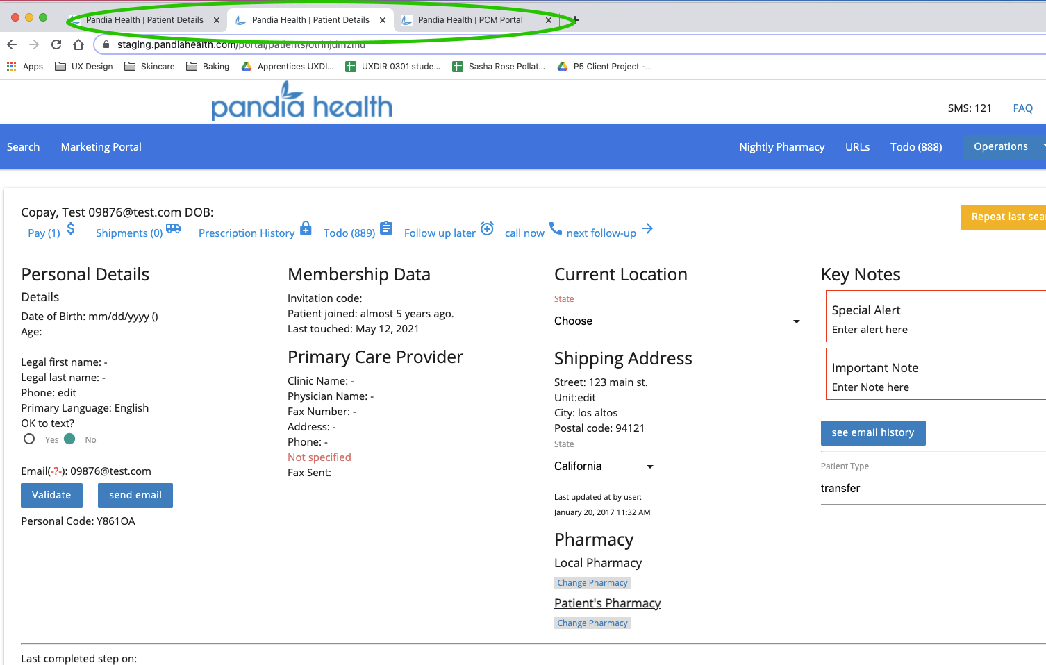
Color-coded pharmacy chat on the right-hand side isn’t used and takes up valuable screen real estate. Features that are infrequently used can distract the Agile Admin from their main goals and even slow them down.
The patient information content needs more visual alignment and composition, as well as an organizational layout to prioritize key content.

Consistency & Standards
This is the NOTES section on the patient information page. Currently, it is split into three different sections: internal, pharmacy, and medical. This is an unconventional way to filter and navigate internal memos.

Recall vs. Recognition
Currently, there are five distinct global navigation elements. This requires users to remember which global features are available on which menus instead of having one easily locatable navigation element.

The Solution & Staying in Scope
After a week of research, it was time to ask, what exactly is the problem? How are we going to tackle it? It was important to remember this was a three-week design sprint so keeping our scope narrow and focused would be of the utmost importance. We chose to focus on just two pages: the search page and the patient profile page.
Problem Statement
Key patient information is scattered and grouped inefficiently, and there are irrelevant features that get in the way of this key information.
Navigation relies on recall over recognition, as it is scattered across five distinct global navigation elements and doesn’t rely on any consistency or outside standards.
Filtering and sorting are absent in search filters. Going back and forth between searching for patients and viewing their profiles is time-consuming and requires starting a workflow from the beginning multiple times within a single task.
These problems increased time on task and made it difficult to onboard new PCA’s.
Design Hypothesis
Tasks are taking too much time as the interface is bogged down with Irrelevant features and key information is scattered across the portal making it hard to scan.
Creating a single, global navigation sidebar will optimize the navigation of the portal, as well as increase recognition and reduce the need to recall locations of functions.
Introducing consistent, industry-standard tabs, filters/sorting, and search options will allow the user to navigate and multitask with ease, performing searches while simultaneously working on multiple patients.
By applying all three design hypotheses, we predict The Agile Admin will perform their job duties more intuitively and efficiently.
Information Architecture: The aha moment
For this sprint, we didn’t need to reinvent the wheel. I spearheaded the consolidation of the information architecture of the website. Here I will show you the current site map, the proposed site map, and some key differences between the two. My aha moment came when I realized, the problem didn’t rest in the organization of the page but in the organization of the content on each page. The architecture of this site is fairly uncomplicated however, everything being first-level navigation doesn’t generally mean more ease of use.

Current Sitemap
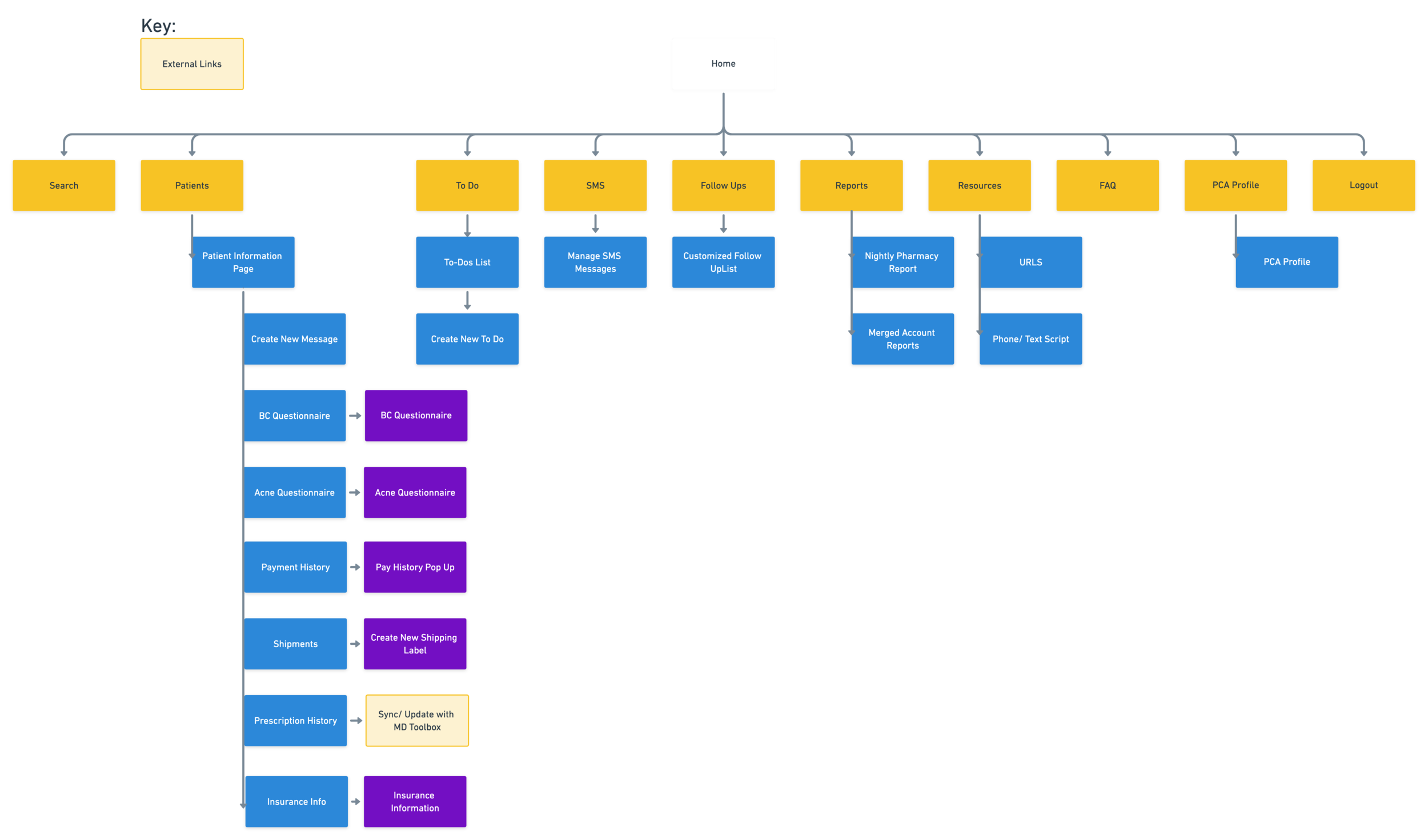
Proposed Sitemap


Design Dissection
Current “tabs” process
In order for Patient Care Advocates to accomplish tasks, they need to have multiple tabs open on their browsers at all times. This can bog down the system and decreases portal security by adding multiple points of contact to the server.

Proposed Tab System
By placing a tab process into the portal itself

5 distinct navigation elements
Navigation is a huge factor in the increase of time on task. The side chat (5) is an unused feature that is global and taking up valuable screen real estate on each page.

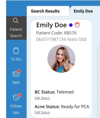
Proposed Sidebar Global Navigation
By consolidating the navigation and placing appropriate features into a global sidebar, the need for recall is decreased. Functions are clear and easy to learn.

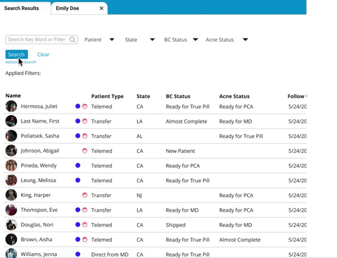
Current Search Bar
The current search bar has a long list of quick search buttons that take up a significant amount of screen real estate. It also contains the unconventionally and rarely used feature “repeat last search”.

Proposed Search Bar
The new search feature includes a quick search. It also includes an applied filters section so current search parameters are always visible. Lastly, we included a search bar recommendation query for simple sorting through filters.
To see the design in action, head to my prototype
Usability Testing
Users were asked to perform four tasks on the proposed patient care portal. The tasks were:
1. Search a patient. Locate and update pharmacy information and the next refill date.
2. Locate and verify shipping information and payment method.
3. Find the Notes section, add a new note, and sort by note category.
4. Search a patient with an applied filter.
100% of users completed all four tasks
100% said information was "easy to find"
66% wanted to see notifications for new sms
Key Iterations
Changes that were made as a direct response to insights from usability testing.
Auto-populate
When using the search bar query recommendation. No longer is there a need to press search or anything else, once a BC Status is selected, the search results auto-populate.
Notification System
A notification system was added to the global navigation features “SMS” and “Follow-Ups”. These alerts, shown in red, allow the Patient Care Advisor to see when they have new messages and action items without stopping their work. This directly impacts the heuristic of visibility of systems status.