A concept project focusing on information architecture.
Information Overload:
Where are the dogs?

Time
2-week design sprint
Tools
Figma, OptimalSort, Whimsical
Team
Moriayo Oduguwa
Erin Woo
Role
Information Architect
Overview
Brief: Westside German Shepherd Rescue of Los Angeles is a nonprofit no-kill shelter specializing in German Shepherds and larger breed dogs. Despite their amazing cause, they are facing challenges connecting with users online. Their current website contains a wealth of information that is getting in their users' way as they try to fulfill their main objectives. The users need to learn about and fall in love with their new dog.
Goal: Design a responsive mobile-first website that marries users’ needs with business goals. My personal goal in this project was to evaluate the current information architecture through card sorting and improve upon IA through a proposed sitemap.
Outcome: Along with a team of two other UX designers, I redesigned the website to help the user accomplish their goals. Focusing on improved information architecture I sought to make a better experience for the user that would lead to better foster and adoption matches for the rescue.
Who is this site for?
User Research
In order to meet the user, we conducted a survey of people who were currently looking to adopt or had previously adopted a dog. From the survey, we were able to pull four users out to be interviewed. What I learned in these interviews, along with the insights from a card sort helped me understand the users’ goals and mental model enough to restructure the website successfully.
The main insight from user interviews was that our user wants to be informed. We also found that our user cares about where they get a dog from and want to support rescues and shelters. This was good news as it aligned with the business goals of Westside German Shepherd Rescue to increase donations.

User Interviews
The survey allowed us to find users who were actively searching for a dog, which made them key users to interview. We learned that some people didn’t feel they had enough info going into the adoption process. Interviews confirmed this and basically gave us a concept of who was looking for a dog and what they wanted a dog for. started defining a persona and started looking at the core of the problems, do users have enough information going into the adoption process and how can they have more?
Persona

What does this site do?
Site-Specific Research
I began this process with a heuristic analysis of the existing website and a desk analysis of Westside German Shepherd Rescue. It was important to know more about the client and their needs before diving in. For the heuristic analysis, I used LEMErS and relevant principles from Nielson’s Ten including aesthetic & minimalist design and help & documentation. The heuristic analysis showed that there were significant challenges with navigation and a lot of material to sift through.
Homepage
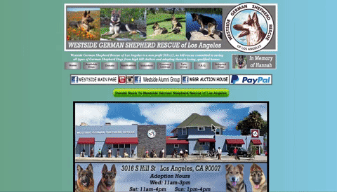
Meet the homepage
Endless Scroll of information reads more like a blog than a website. The use of many colors violates the heuristic of aesthetics & minimalist design.

Card Sort Analysis
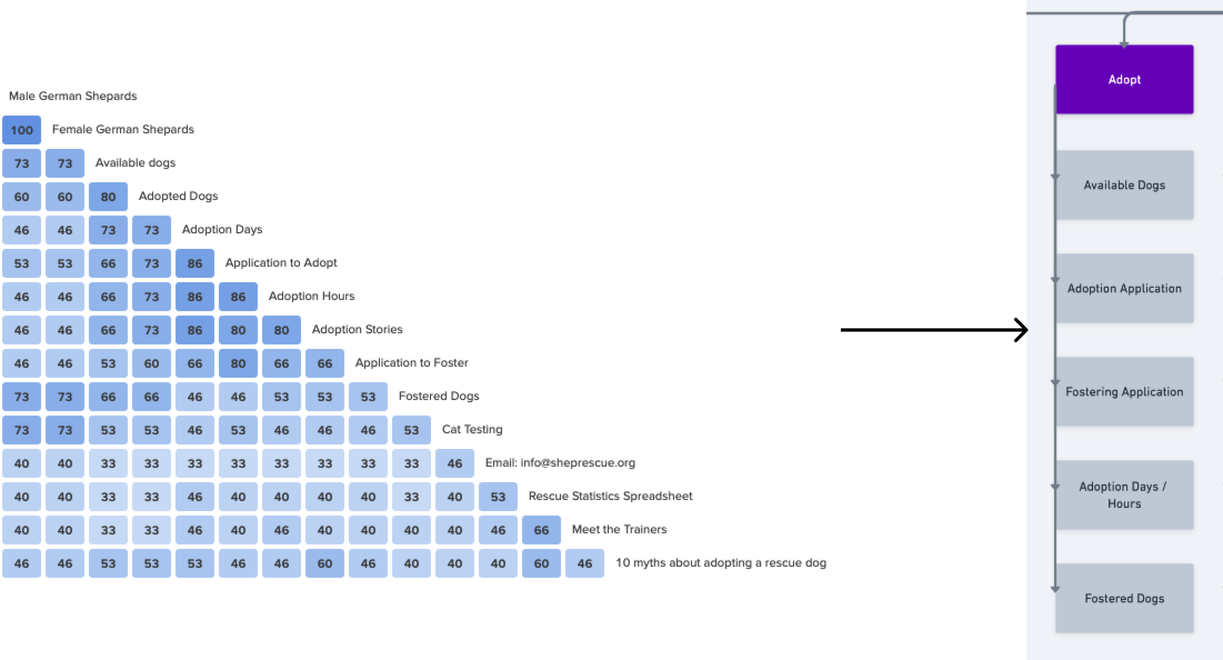
An open card sort was conducted with 15 users completing the task. The card sort was populated with every feature on the current website and users were asked to group and label all features. The following shows the insights of what was grouped most often, giving us a look into our users’ mental model of organization.


The Big Pieces
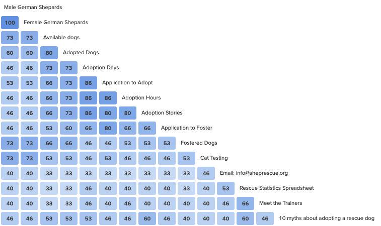
Adoption Section
There was clear agreement in all of the adoption information being grouped together.

Shopping Section
Wishlists and ways to purchase merchandise were categorized together.

Social Media
On the current site, social media links are spread out in at least four different sections. Our users placed them all together.

Donation Section
The numerous ways to donate were also placed together by users in the card sort.
“About”, “Donate”, “Adopt” and “Shop” categories were created for our new sitemap/information architecture based on the following findings.
64% of users would use the title “About” “About Us” “Who We Are” as a group header. The current website does not contain an about us page.
50-92% of times donation links were grouped together
65% of users grouped all applications and adoption/foster info into one category commonly named “adopt” or “about our dogs”
57-78% of users grouped all purchasable items and external links to purchasable items in a category called “shop” or “shopping”.
The small stuff.
Social media links were grouped together 92% of the time, confirming the hypothesis that these items should all be grouped together.
Social media, FAQ, and contact information were commonly placed in miscellaneous categories. Based on this finding, these categories were placed in a footer in our new information architecture.
There was no clear agreement on the Volunteer features for the site.
What does this site need?
Research Synthesis
The attentive adopter was the synthesis of the user research. Taking into consideration the heuristic analysis and key insights from the card sort, we set out to define the problem and the solution as we saw it. This problem statement and design hypothesis confirmed once again that my focus on information architecture would be vital to the redesign of this website.
Problem Statement
The attentive adopter is frustrated because
There are too many choices and too much information on the landing page.
The navigation is full of broken links.
Donation features feel prioritized over adoption
The adoption application is long and complicated.
It is difficult to learn about each dog and make informed decisions.
They encounter a lot of text that is irrelevant to their primary goal.
They don’t know where they are on the website.
Design Hypothesis
The design hypothesis is that the adoption process would be more approachable if the site:
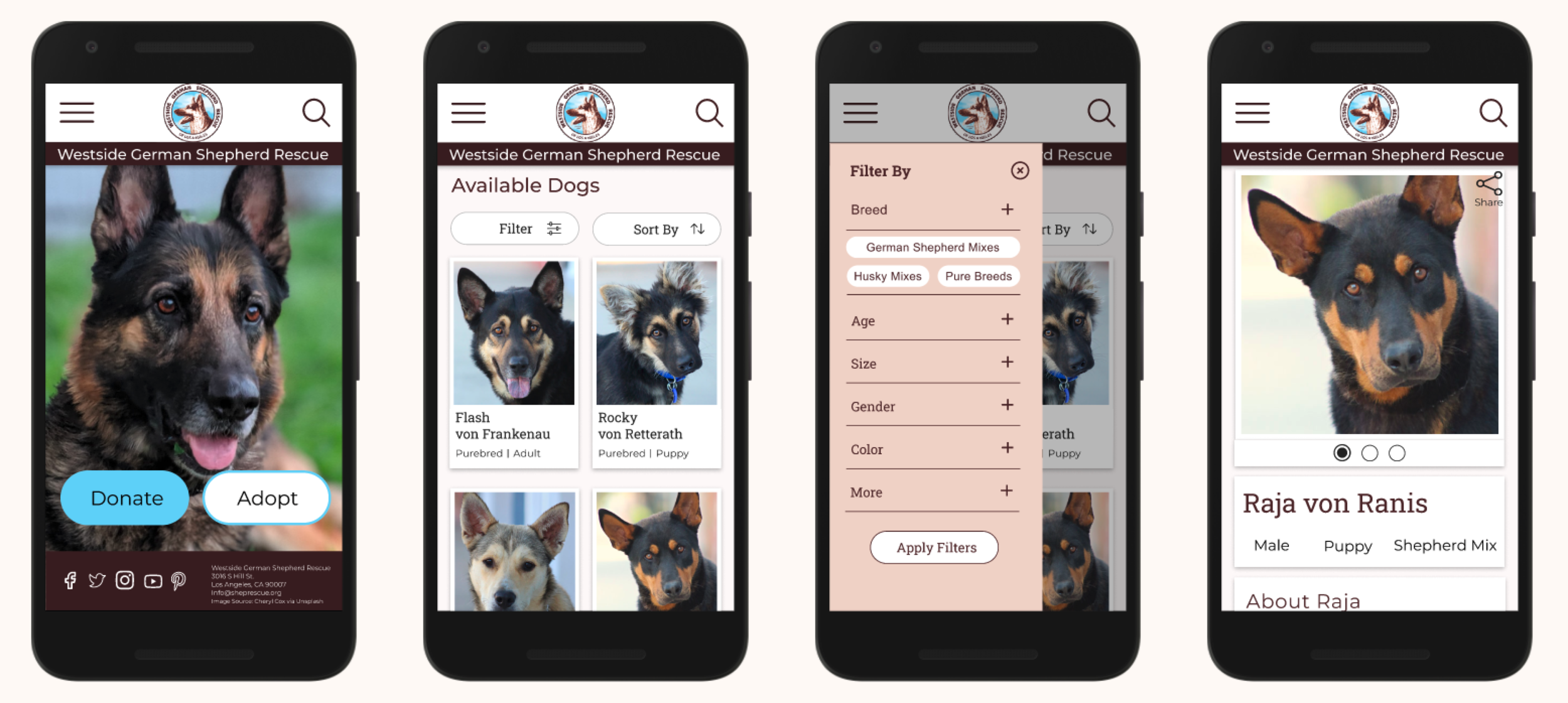
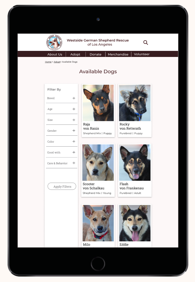
Reworked information architecture to prioritize important information and nest less important info in 2nd and 3rd levels of architecture and navigation.
Included adoption tiles to provide descriptions about the dogs that are quick to access and informative.
Created global search and faceted navigation (filtering) for ease of use in finding a match.
Created breadcrumbs, or contextual navigation, so the user knew where they were.
Created a cohesive donation page that donors can feel secure about.
Simplified the adoption/ pre-approval form.
In order to solve these user concerns we needed to focus on adoption and donation, and let the rest of the features fade into the background. Establishing a hierarchy and a more pleasurable experience for the user.
The idea was simple: if you want to adopt out german shepherds and receive donations, focus simply on those two components.
Information Overload
Current & Proposed Sitemaps

The site map went from over 30 top-level navigation to seven first-level elements including a footer and the rest of the features being nested in secondary and tertiary navigation.

These categories were derived directly from the card sort information. Note the name of the section “shop” was changed to “merchandise” so that it wouldn’t be confused as “shopping for a dog” which is the antithesis of what a dog rescue does.

Mockups

To see the design in action,
check out the prototype
Key Iterations


What’s it called?
During usability testing, we learned that the name of the rescue was not prominent and thus the user couldn’t remember it. We emphasized the name of the website on the home page.


We added a confirmation code to the end of the adoption application.